Ahead of Saturday’s home match against QPR, let’s look at some of the in-depth stats and analysis of both sides and how they compare with each other as well as the rest of the Championship season.
With 9 games played and roughly 20% of the season completed, we can start to get a decent idea now of how the teams are stacking up and there’s clearly work to do for both QPR and Swansea City.
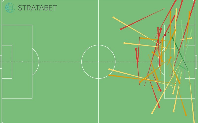
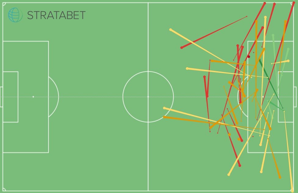
Shot Assists Maps
But first, let’s compare Swansea and QPR’s shot assists maps to see a comparison of how many chances they create and where they create them from. Below, Swansea’s shot assists map is on the left with QPR’s on the right. Already you can see QPR have a greater number of shot assists (passes which lead to a shot at goal). The colours – a red-to-green scale show the quality of the chance that was created. For example, the dark green line on Swansea’s map shows Montero’s ‘Superb” chance created for Oli McBurnie as he easily turned in the late winner at Millwall a few weeks ago. The vast majority of QPR’s assists come from wide and deep positions – most of which of poor quality. Swansea, on the other hand, create most of their chances higher up the pitch compared to QPR with many of the assists being sideways passes.
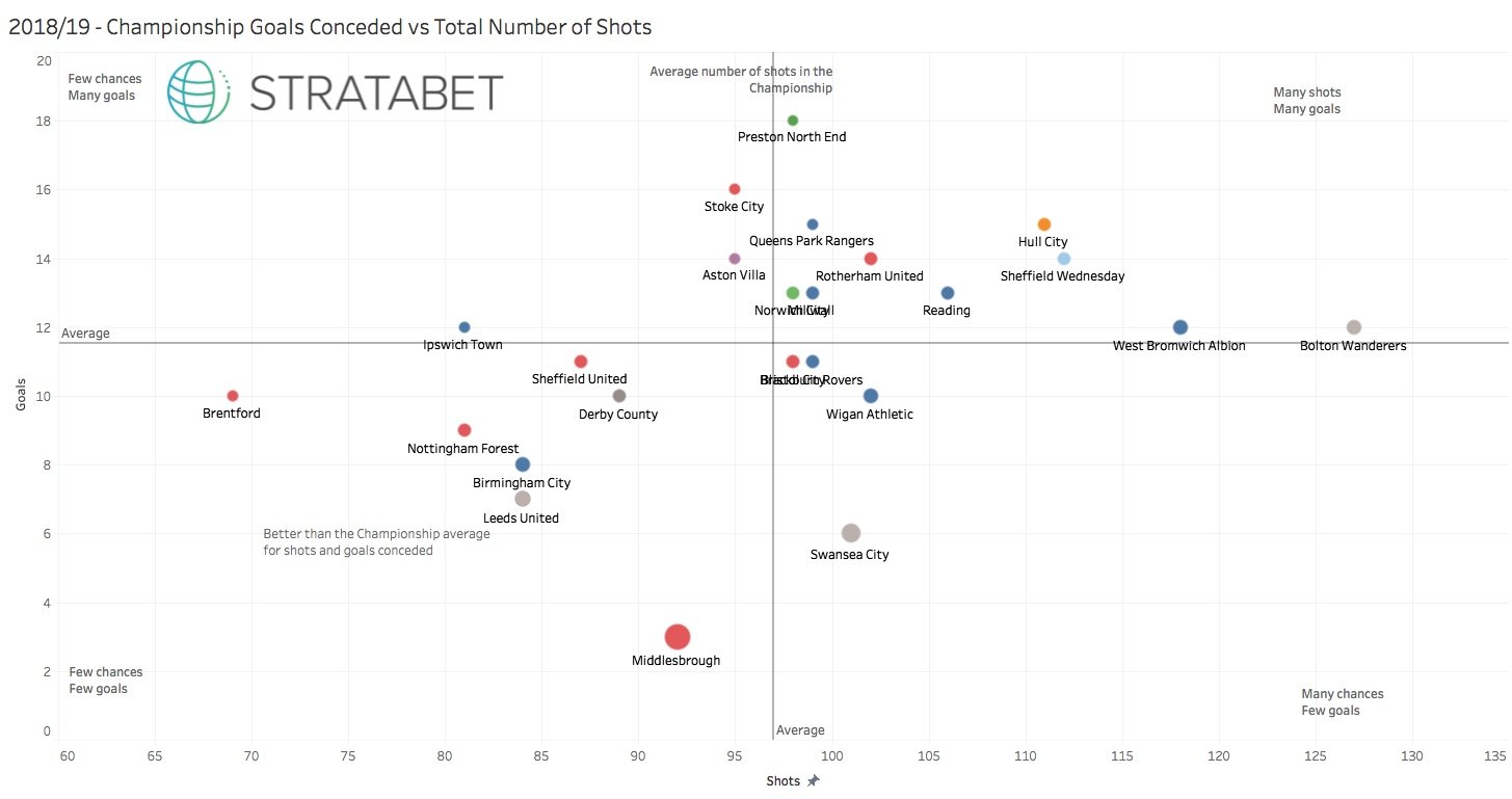
Championship Comparison – Goals and Shots Conceded
The graph below shows how each Championship side stack up defensively. The ideal place to be here is at the bottom left of the graph. The lower on the graph = fewer goals are conceded, further to the left = fewer shots on goal are conceded.
QPR have conceded fewer shots on goal compared to the Swans but have conceded 9 goals more. The Swans are also bang on the average mark line (vertical line) for shots conceded and significantly below average for goals conceded. Only Middlesbrough have conceded fewer goals than Potter’s side this season.
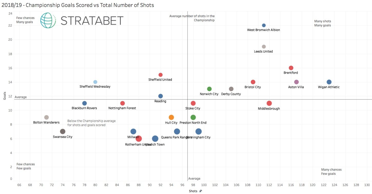
Championship Comparison – Goals and Shots For
Looking at the attacking performance, this is the area where Swansea City really need to show some drastic improvement.
On this graph, you want to be at the top right. The higher up the graph = the more goals scored, the further to the right = more shots on goal.
The likes of Brentford, Wigan, Leeds and West Brom lead the way here but the Swans are at the opposite end of the graph with the fewest shots of any side in the division.
Fortunately, we’ve been clinical when we’ve needed to be and scored 7 goals in 9 games, only Ipswich and Birmingham City have scored fewer. QPR are right next to Birmingham – just to the left of the vertical average line for total shots on goal. The size of the circles represents the total number of shots needed per goal scored (total shots/goals scored) = the smaller dot – the more clinical the team.
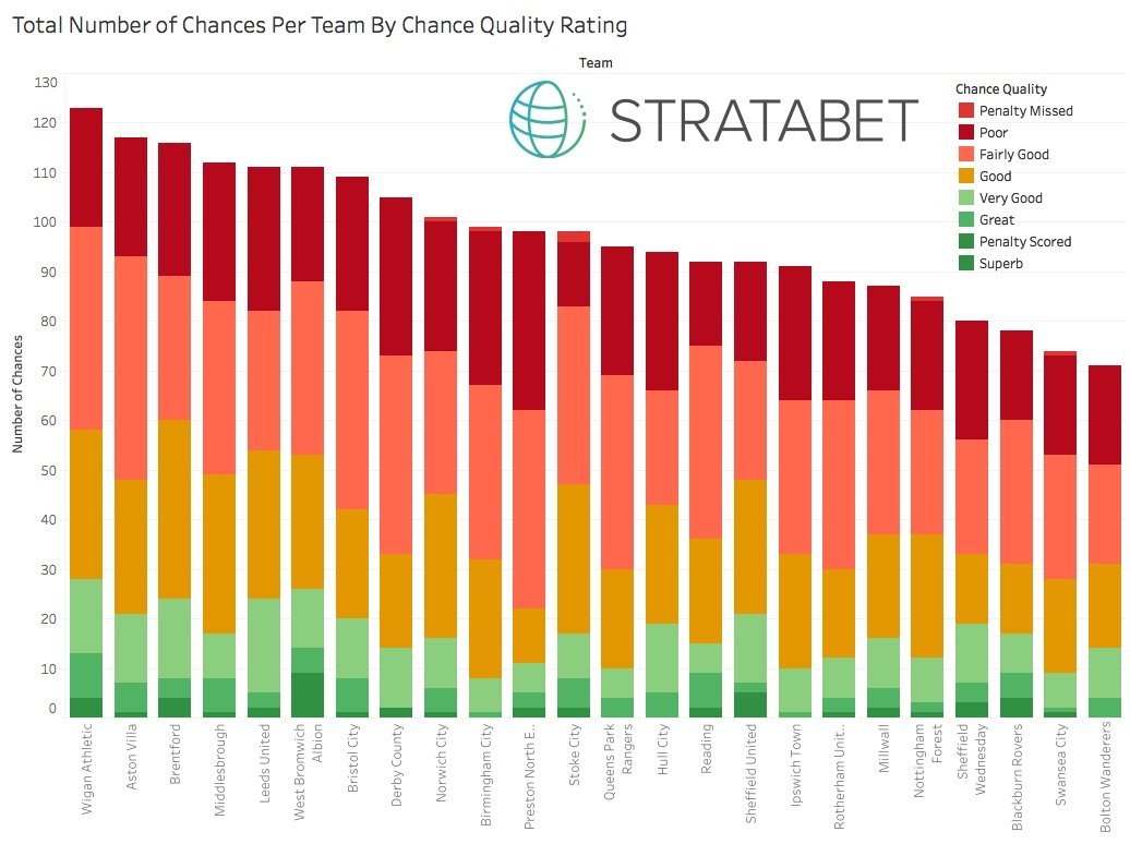
Total Chances Created By Quality
Again, Swansea City perform poorly in the attacking comparisons and only Bolton Wanderers have created fewer chances.
The graph below shows the total number of chances per team split by the quality of the chance. The Swans have only created one “Superb” chance – which was Montero’s chance for McBurnie’s late winner at Millwall. West Brom and Sheffield United are both high on the Superb chance quality count. QPR, just below mid table in the graph, like the Swans – also create a low number of high quality chances.
The stats would suggest a low number of chances and a low number of goals in Saturday’s game but it must be seen as a good opportunity to get back to winning ways after failing to score in four of their last five games.
This article was written with the aid of StrataData, which is property of Stratagem Technologies. StrataData powers the StrataBet Sports Trading Platform.