“Passing Network Maps” is something brand new that will be a regular feature on the Vital Swansea website as we aim to provide a clear and detailed insight into our passing performances in the Championship next season.
The pass maps will provide average passing positions for all players as well as:
- Low, Average and High phase average passing positions
- Total number of passes
- Passing success rate
- Top 3 most common direction/length of pass
You can read our detailed article on how they work and how everything is calculated here.
The first pass map we produced was from our 1-0 home defeat against Southampton, our penultimate Premier League game that saw us underperform yet again, failing to do what was needed to stay in the English top flight.
The pass map reflected the performance and how much our former style of play has simply disappeared.
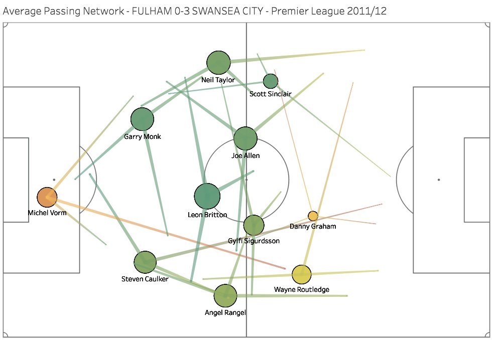
With Graham Potter now finally confirmed as our new manager, we thought we’d look at some of the main differences between the pass map against Southampton, and the one from our famous 3-0 away win at Fulham when Brendan Rodgers was manager in 2011/12.
Yes, it is two extremes. The 3-0 win at Fulham has been hailed as our best and most complete away performance ever in the Premier League, while the one against Southampton last month was something we’ve become used to – unfortunately.
Graham Potter’s appointment hopes to re-establish and restore our former reputation for being a team that plays attractive football.
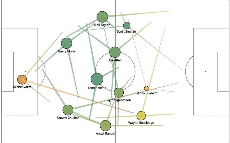
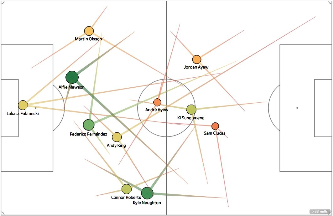
Average Pass-Map: Swansea City 0-1 Southampton, 8th May 2018
To summarise what everything means in the pass map below:
- The locations of each player represent their average passing position – using a more accurate clustering analysis tool rather than simply the average of all passing locations. This is used because, for example, a small group of passes high up the pitch can potentially skew the average.
- The size of each circle/line represents the total number of passes – this includes overall attempted passes.
- The colour of each circle/line represents passing success rate – a red – amber – green scale, with red lowest and darker green highest.
- The lines represent each player’s 3 most common passing locations. The positions on the pitch that the players pass to are grouped into 3 clusters, and each end passing endpoint represents the centre position of those three groups.
Some of the main observations to make looking at the pass-map below are:
- the length of passes (mostly long, particularly out from defence)
- Small circles representing a small number of passes
- imbalance and focus on the right flank
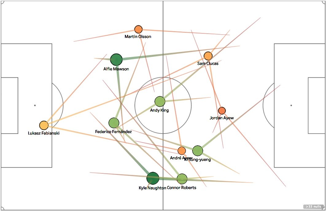
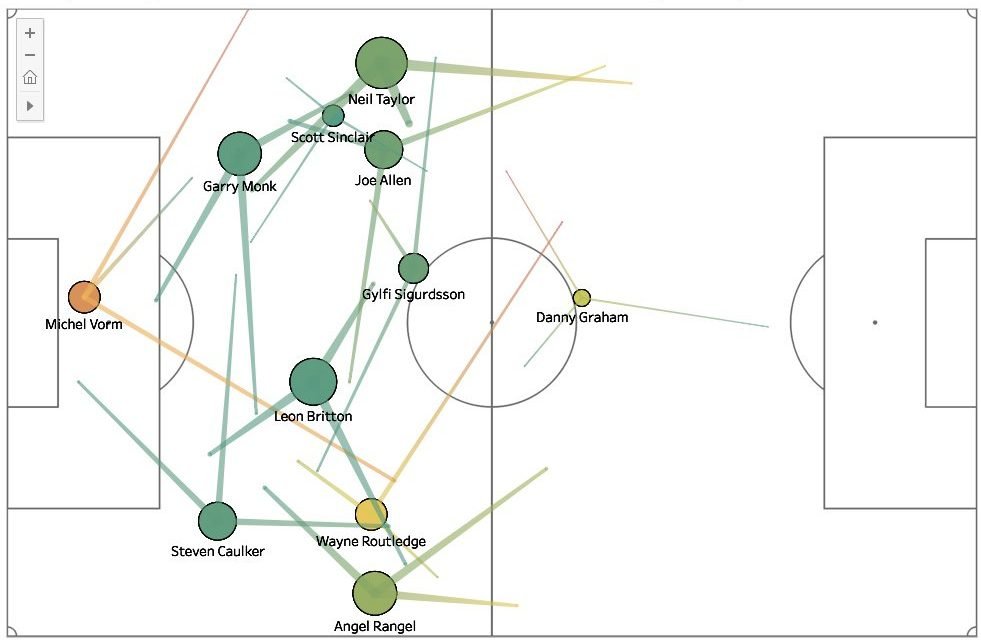
Average Pass-Map: Fulham 0-3 Swansea City, 17th March 2012
The pass map from that famous away win at Fulham from 6 years ago is entirely different to the one above. Far bigger circles, mostly greens throughout the team representing high pass success rates and shorter passes. Most of the passes travel the length to the next closest player, rather than half the length of the pitch!
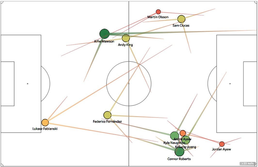
Low Phase Passing Network
The low phase pass maps below shows the average passes made by each player in a low phase of play. In other words, the passing locations of each player are grouped, and a low group and a high group are identified for each. This aims to show the difference in passes in a deep position and a high, attacking position.
The side-by-side view below shows a big difference in the two. Passes are much longer from deep on the left against Southampton and therefore it’s no surprise to see the players more spaced out on the pitch. There’s also a severe lack of central midfield presence in the example against Southampton, whereas both Leon Britton and Joe Allen stole the show at Craven Cottage.
vs Southampton, 2018 |
vs Fulham, 2012 |
 |
 |
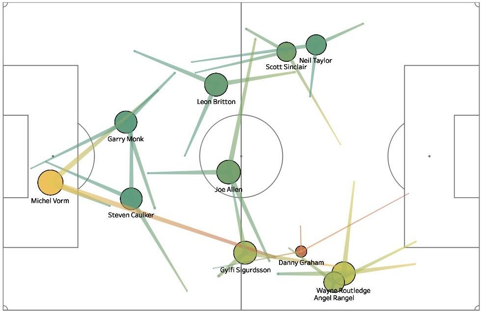
High Phase Passing Network
The high phase map shows the passing patterns in the attacking or high phase of the pitch. Both examples show how the players shift into wide positions, but against Fulham, Joe Allen provides a central pivot, spraying passes to both flanks and behind.
Again, passes in general are shorter on the right, particularly amongst the defenders; and the full backs only have 1 backwards pass of the three, as opposed to 2 in the pass map vs Southampton.
vs Southampton, 2018 |
vs Fulham, 2012 |
 |
 |
Graham Potter did things the hard way you could say during his 7 years at Ostersund. Rather than simply focus on doing what was needed to get results, he implemented a refreshing style of attractive, passing football that attracted Swansea’s hierarchy to hire him.
Potter will, of course, implement his own style of play, but we’d expect to see our football resembling something similar to what we saw under the likes of Martinez, Rodgers and Laudrup – if he’s given the freedom to sign his own players that is.