For the new 2018/19 Championship season, we’ll be looking to develop what we’re calling ‘Passing Network Maps’ – a graphic that will aim to show the team’s average positions based on passes, the number of passes per player and their most common pass locations.
What Are They?
Hopefully, they will give an insight into a number of different tactical aspects from Swansea City’s passing performance – the overall shape when in possession, which players passed forwards, backwards etc. and which players were more involved in the attacking build-up phase in particular.
Average positions and pass maps have always been something that I’ve been interested in, but they’ve usually been lacking something – one way or another. Average positions only show as it says – average positions based on all touches – and pass maps (via Twitter user @11tegen11) are simply based on who passed to who. They are useful to show common passing link-ups between players and who played the most passes, but they can be misleading – mainly because passes are linked player to player, and they don’t necessarily show the area of the pitch where the pass was played to.
Our passing networks aim to show a better representation of the passing network, so we’re not really interested in who passed to who, but who passed where – in what areas of the pitch.
So are our full backs passing forwards or backwards in the attacking phase? Are they passing along the flanks or in-field? What areas of the pitch are our midfielders passing to? Are our attackers dropping deep in passing support or moving wide?
How Is It All Calculated?
Without boring you with too many details, a model and a calculation are developed based on two sets of data for a single match – the x and y co-ordinates of passes – where the pass was played from, where on the pitch it was played to and by who.
Using that data, we then run multiple runs of cluster analysis – firstly on the x and y coordinates of where passes were played from, to get the players average passing location.
Then we do the same for the x and y coordinates of where the passes were played to. The cluster analysis groups the data points, and for each cluster, we have a “centroid” – a centre point of each cluster, an average – showing us the three most common locations of a pass.
So that we’re not completely relying on a computer and its k-means clustering ability, the clustering analysis is checked manually so that it makes sense. In other words, for each player, we look at the graph for their passes (both where they are played from and to) and ensure that the results of the cluster analysis make sense and are accurate. If not, the cluster analysis is run again until it does.
Example
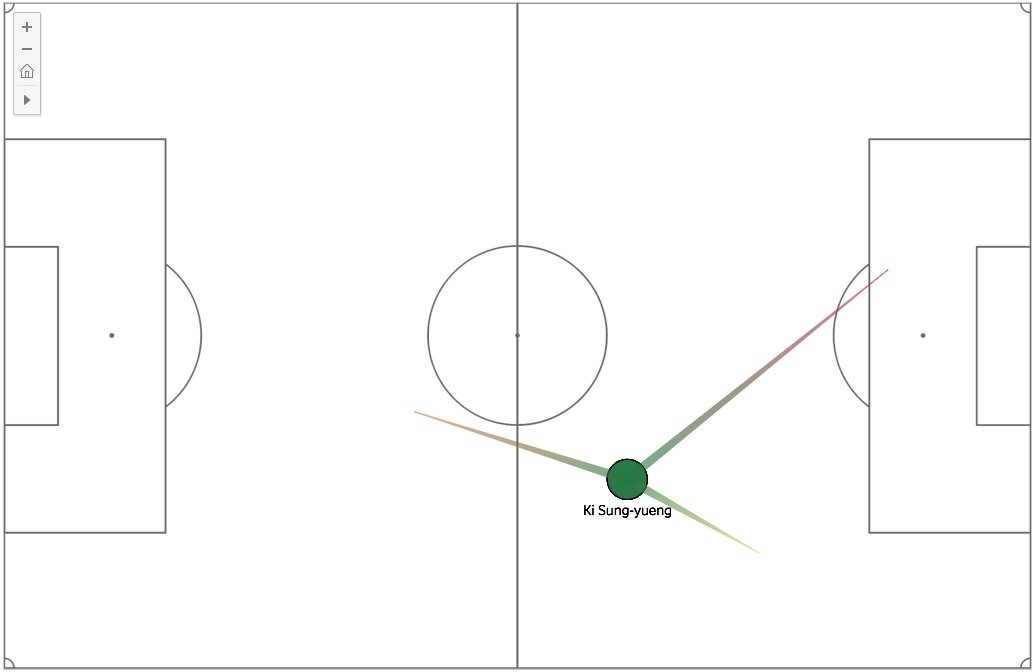
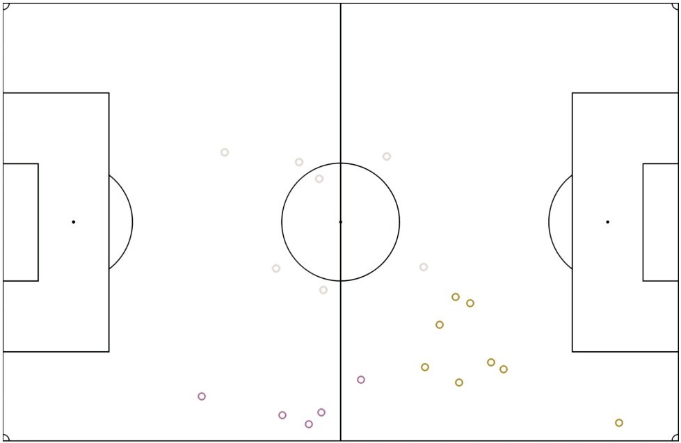
The below image shows all the locations where Ki Sung Yueng passed to in our 1-0 home defeat against Southampton.
What our clustering tool then aims to do is to split these passes up into 3 different clusters or groups. The centre point of each cluster is then calculated to produce the player’s pass network as shown below:
So the tool identifies Ki’s three main areas of a pass as:
- Back into defence / his own half (9/35 passes – 26%)
- Wide right area (19/35 passes – 54%
- Attacking passes towards the penalty area (7/35 – 20%)
Calculating The “Low” and “High” Passing Networks
As well as the overall passing averages, we also narrow the data down further, splitting it into 2 smaller groups, a low average (deeper on the pitch), and a high average. This aims to show the early phase of a passing build-up and the final phase of an attacking build up.
Cluster analysis is then run again for each of these 2 smaller groups and shows the most common passes for each group. So in the next example, we’ll take a look at Andre Ayew, who drops deep into midfield to help in possession in a low phase, before moving upfield in attack.
This allows us to see different players movements in different phases of play.
Below shows all of the locations where Andre Ayew made a pass from in that game against Southampton. They are colour coded into clusters. The tool returns 3 clusters, and we then manually select the two best clusters for a low and high average. In this case, we decided to choose the central, silver cluster for the low phase average (7 passes) rather than the purple cluster (wide right area, 5 passes).
The image below shows Andre Ayew’s positions and most common passing routes for the low, average and high phases of play.
The low phase (silver cluster above) is shown in the centre circle below, the average (green) and his attacking passes (gold cluster above).
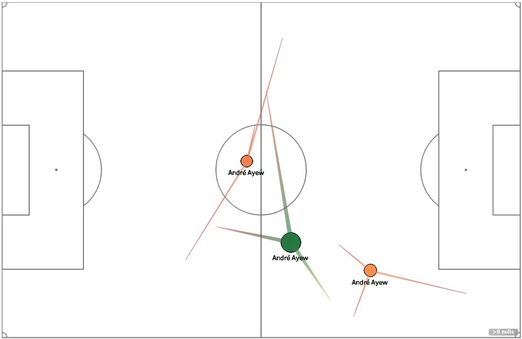 To get the top 3 passes for each of the three different phases, cluster analysis is run on the passes made in each group. So for example, for the low phase, we only look at the passes that Andre Ayew made in that silver, central cluster, and so on.
So we know that from the central, low position, Andre mainly made passes into wide areas, his passes were shorter in an attacking wide right area.
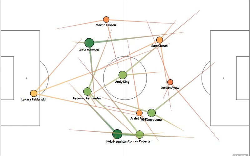
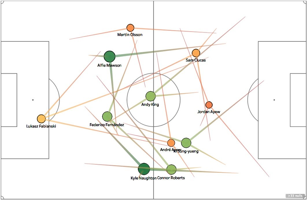
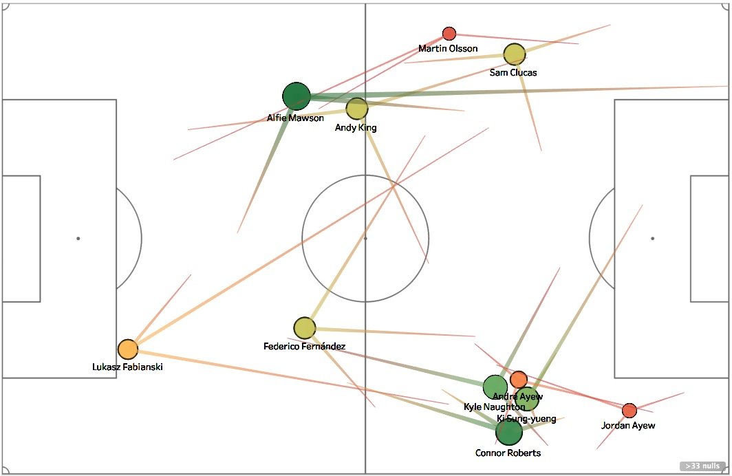
Full Average Pass-Map
Here is the full pass map for the Southampton game. The passes only include those made up until the 60th minute – when the first substitution was made. This is mainly for balance and a fair representation per player – so all players in the example played for the same amount of time.
The colour-code is the number of passes attempted, with red and orange being low, and green to dark green being the highest.
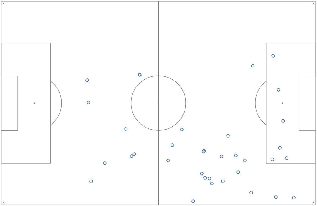
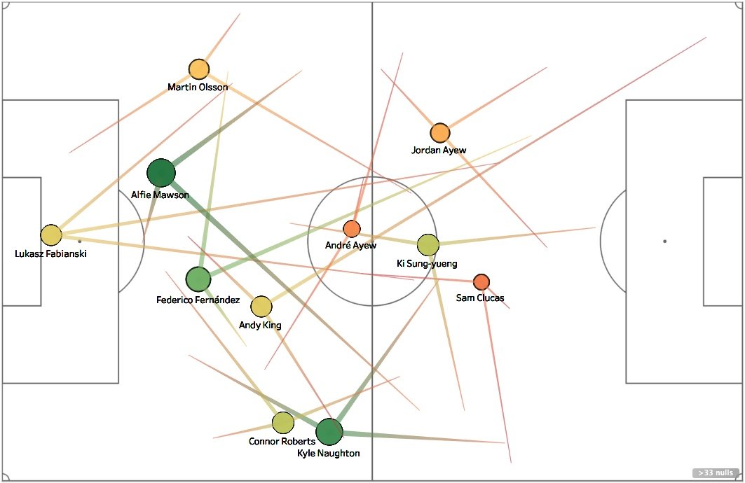
Low Phase Pass Map
The low phase pass map below shows the passes made by each player in their deepest average position. The most notable thing here is the lack of short passing out from defence, with long, direct passing from deep.
High Phase Pass Map
The high phase pass map below shows the team changes shape as possession moves forward up the pitch.
Alfie Mawson and Federico Fernandez split wide, and so do the rest of the team, with an emphasis on the right side. There’s a severe lack of activity through the middle of the pitch, with the majority of it down the right.
The high phase map also gives an insight into the direction of passes. Were most passes made forward higher up the pitch or were they sideways and backwards? 2 of Olsson’s most common passes were aimed backwards into his own half – same for his opposite number Connor Roberts.